Thursday, December 22, 2011

Holiday Arting Around

Been slacking on personal work in a serious way, but look at some of this holiday stuff I've made!

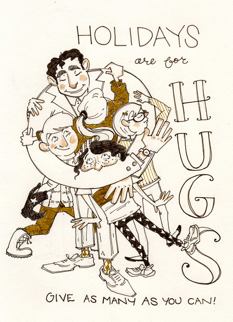
hugs

Here's a card I sent to some folks

wrap

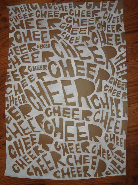
And some wrapping paper I painted

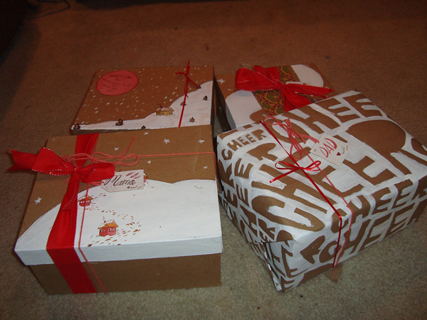
presents!

And these are the MVPs of this year's wrap-a-palooza

Happy Holidays everybody!

Thursday, December 1, 2011

Tippecanoe & Tyler Too

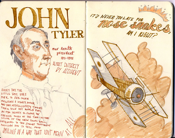
i cannot believe it's december. i cannot believe that i only have two spreads of this sketchbook left.

tippecanoe & tyler too

Saturday, November 19, 2011

Willows, Civil War Generals, and Patsy

fadedlove


Rolling Stones covering Sam Cooke? Dream Dream Dream. Also, check out Keith singing backup. Adorbs.

Friday, October 14, 2011

Collab's Alive and Well

I know that one of the only swaps from Ten Paces and Draw that I've ever posted on my personal blog was a collaboration between me and the fabulous Justin Volz. And even though I've been doing these swaps since late March (OH MAN MORE THAN 6 MONTHS), I'm not usually interested in double-posting them over here on my other blog. But this one was too good to pass up.

RDcircusblog
Justin Volz

I love how much quieter and trendier Justin's sketch is. He's so super great, and so much different than my work, which comes out so much goofier and kidsier than his sketch. But that's what I like about my work, and what I like about his work, in such a different way.

And that right there is the whole point of the blog. I'm glad that 6 months in I'm still learning stuff, and still stoked to be a part of it. So HEY GO CHECK OUT THE REST OF THE SWAPS!

Tuesday, September 20, 2011

Monday, September 19, 2011

Little Red Riding Hood

Been a while since I did a legit storyboard. But I really crushed through this one, 32 PAGES, 1 DAY. THUMBNAILFEST.

Anyway, here are a few of them that I thought looked cool.


Not exactly refined, but I suppose neither am I.

Tuesday, September 13, 2011

NLC Philly Part Deux

I have been so absent from this blog...when I finally get back to it it's just gonna be an art dump. Here is why:


So that happened. But yesterday I did some graphic design work (HAAAHAAA) for Laura's political organization again. You can see the last piece I did for them HERE. But this one had a whole lot more text and a lot less illustration, which makes me itchy...but I tried my best to make it look professional anyway. And I did a Philly skyline!

Sunday, August 14, 2011

PREIT Back To School Style Multiplier

After many months and many paintings, PREIT's back to school style multiplier is up and running! And I have finally gone to the trouble of blogging about it! I painted the heads, arms, legs, and hands of the characters, as well as their rooms, and the folks at Pennsylvania Real Estate Investment Trust photoshopped my work into their back to school clothes and put together this great website. Not only is the website pretty crazy and awesome, but they have made big posters of the pieces targeting the nearest mall demographics and put them up on the SEPTA buses and regional rail!

Here are a couple cell phone photos that I was able to get (thanks to Laura Henderson, as well!) which are not super great in quality, but pretty awesome being that this is not the first time my work has been on a city bus!


So that is pretty slammin'! Enough to make me a little proud, anyway :)

Here are a couple of my favorite screenshots from the style multiplier website:

(click to embiggen!)

(click to embiggen!)

You can check out all HERE!
Friday, June 17, 2011

Pattern


So this week over at Ten Paces and Draw we had a pattern theme. Alyssa was completely stoked, and the bulk of our guests were her prospective colleagues at Paper Bicycle, so they all rocked out hard. Being completely out of my element, I was a little hesitant...and to be real, Chris Hajny (who had my sketch) really saved my hide and made my piece look great. I don't know the first thing about making a pattern. But you know, I still really like the look of this piece. I don't think I would have ever come up with making something like this on my own, and I might have ditched the lettering, but i think all those noses look pretty cool.

Check out Chris's final piece though! It looks bang-a-rang, rufio.

Friday, June 10, 2011

Far Out, Man!


It was space week at Ten Paces and Draw! I can't say I've ever really done any space stuff before, but I was pretty stoked about it. Unfortunately, my sketch didn't really make it to final. Which is terribly disappointing because I was super proud of it. If I weren't being held at illustration gunpoint for a variety of other projects, I'd definitely finish it myself. Maybe someday soon. But all the same, I had a blast with Niki Maro's piece. And her final is even better!

Monday, May 16, 2011

Back To School Lettering


i like laura the best. but she knows that.

Back to School Miscellany


and here's some of the floating stuff


i ♥ this dogggg

and yea, for all of you that recognize that trunk...I know. I just love it.

Back To School Promotion

So a while back I was asked to do this back to school promotion for a company I used to intern for back in the day. The project is a bit complicated to explain, but suffice it to say that it's been pretty long and involved and has a lot of parts. And it's definitely still not finished. I'd say we're about halfway.

Anyway, it's a web promotion, and the gist of it is that there are five tween/teen characters modeling back to school fashions. They're in their bedrooms, and certain objects might need to be moved around or used as hotspots, or what have you. So there's the room backdrop, the objects left separate, the name plates for the entry page, and eventually there will be five sets of five characters, modeling clothes. Gevolt, I said. BUT WHEN IT'S DONE I THINK IT WILL BE THE COOLEST.

Here are the first three backdrops


Friday, May 13, 2011

Swaps and Experiments: Get Low Get Low Get Low

This week over at Ten Paces and Draw our theme was Pretty Ladies. I drew this girl getting ready to drop it like it's hot, which I was pretty stoked on


and then Justin Volz took it to final to create this


which looks absolutely fantastic. Getting involved with this swap blog has been really interesting in a whole bunch of ways. It's really cool to see what people do with my work, what they leave in what they take out. And I think this particular one was awesome because it's so different from my sketch, but the feeling is still there. I like how sophisticated it looks. Somehow so much more grown up than mine. And yet, that's also kind of what I miss when looking at it...that awkwardness and goofiness that I always bring to the table without even thinking about it. So I thought I'd give it a whack, to practice some coloring of my own. Here's mine:


I still can't say that I like coloring digitally better than painting, not even a little bit. But it is pretty fun sometimes anyway.